
Marianne Shillingford puts colour at the heart of everything she does
“Pick a palette that matches your personality, captures the right mood and gives you what you need from the space.”
There aren’t many people who can get away with wearing neon pink tights. Marianne Shillingford, however, is definitely one woman who can. “My husband does say I sometimes dress like a children’s entertainer,” she laughs. But as Creative Director of international paint brand Dulux in the UK and Ireland, embracing colour in every aspect of life is her consuming passion.
“Colour makes my heart soar every day,” she says with a thrill in her voice. You can’t help but be swept up by the happiness she exudes as she excitedly describes how colour just makes life better.
For the last 20 years, Marianne has been influencing the colours that we all have in our lives, capturing a global mood and translating it into what paint shade to put on our walls to bring us what we need – whether that’s to pick you up or calm you down. This is because she is one of the key figures in the colour trend forecasting that results in the Dulux Colour of the Year.
“When we’ve all got a bit more money and stability, colour isn’t really there – that’s when the greys and cooler neutrals are around. But as soon as things start to go wrong, we embrace colour and metaphorically hit the town.”
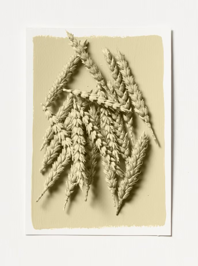
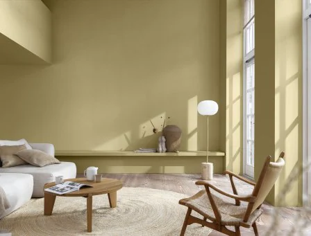
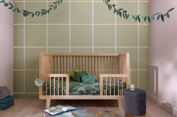
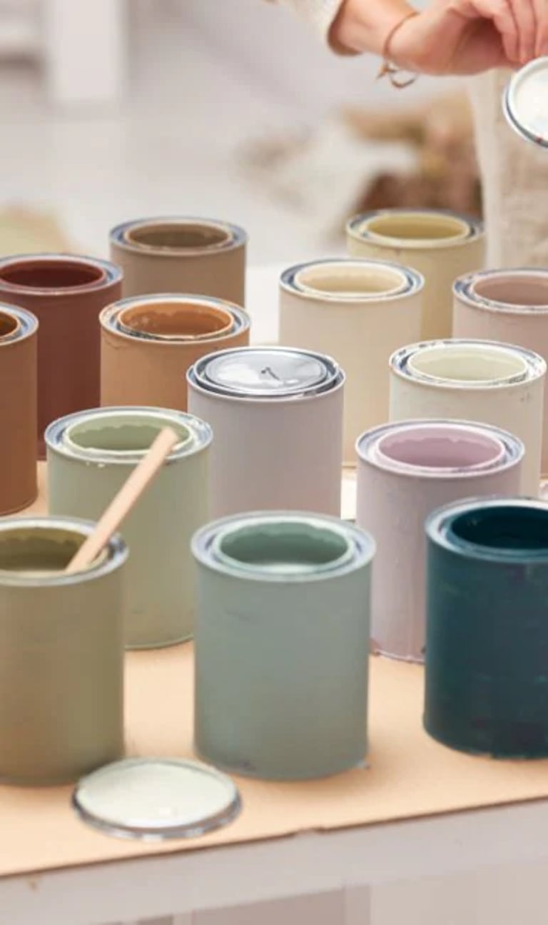
Wild Wonder, the Dulux Colour of the year 2023
The shade for 2023 is Wild Wonder, a positive, glowing tone, inspired by the natural world that is a soft green or cool gold, depending on the light. “It’s all about nature and reconnecting,” Marianne explains. “Because in times of uncertainty, what do we do? We need to find things that reassure us, that are familiar. When we’re stressed, human beings like to connect with something that puts our problems into perspective. When you’re faced with nature – the vast expanse of a beautiful sky, or a beach or a shoreline, being on a mountain top… it puts our troubles into a box, and it helps us feel better.”
This is what she always hopes to achieve with colour – to make people feel better.
“We look to our homes to fulfil a sense of joy,” she continues. “To give us places in which we can interact with our family – or cut off from our family – somewhere we can work better. Right now we are asking so much of our homes – they are having to work bloody hard!”
The good news is that spending more time than ever within our own four walls has also made us think harder about our own identity at home, sparked new interest in what we do with each room, and is redefining what home really means to us.
“Decorating is having a revolution!” Marianne exclaims. “And it’s happening on a really lovely human-response level which is completely delightful. The simple joy of connecting with creativity and expression has been unlocked. Our homes have become the ultimate canvas.”
Marianne shares her expertise on how to interpret the story of our lives into colours that capture what we need in our homes. “It’s about people,” she enthuses. “And what colour can do for us on a personal level.”
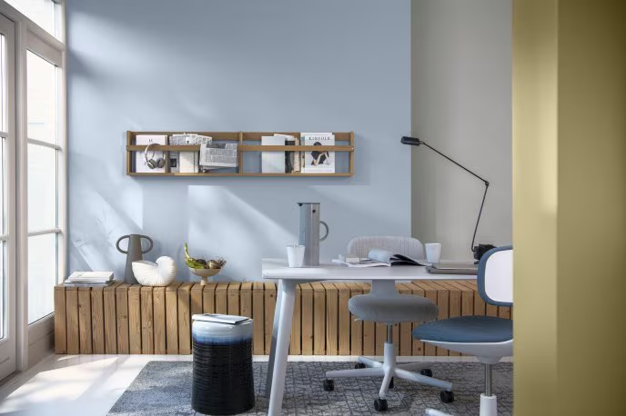
Blue tones can feel fresh and contemporary
10 colourful ways to bring joy into the home
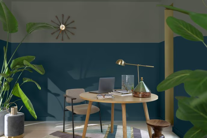
1. Create different zones and spaces with simple use of colour.
We are becoming so much more expressive with this, like putting different paint shades on our ceilings to make them the heart of that space. Or carving out a corner, or a little section of the room that we’ve never really used before. A home working space, or a reading space or relaxing space, or a yoga space – any space can be defined by creative use of colour. Imagine the difference a bright red or yellow sofa would make instead of a beige one. Or try painting a big block, a band, geometric shapes, or a big circle on a wall or ceiling.
Experiment with interesting uses of colour in unexpected spaces to create new zones in your home
2. Enhance a feeling and create an outcome.
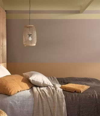
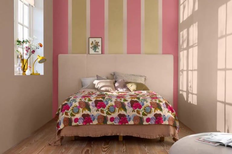
If you don’t sleep very well, for example, using deep, dark colours in your bedroom creates a sanctuary or cocoon. Pick shades for throws, bed linen, curtains or walls slightly darker than you would normally, in order to really make this work. For me, I’m already bouncing off the walls – that’s my personality – and I need something that’s going to calm me down in the bedroom. While I absolutely love colour and want to always surround myself with it, on my bedroom walls I have a beautiful shade called Tranquil Dawn that helps me start the day gently, waking up as if I’m in a misty morning.
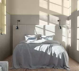
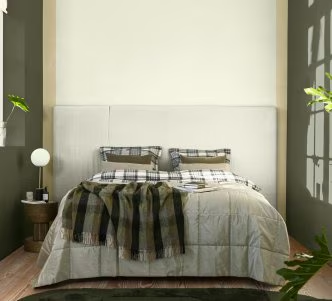
Calming, darker shades in the bedroom will help you get a better night’s sleep
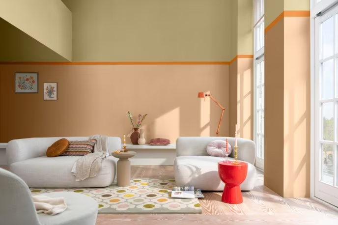
3. Beautiful, bright oranges, reds and pinks stimulate the senses and can make food taste better.
When I’m talking to people about colour, I’ll ask, “What do you want to happen in this space? What’s your family like? Where do you gather? What happens? What do you do? Do you eat as a family?” It’s a little bit like a psychological colour profile, but it’s about asking people who they are and what they want, and then expressing that individual’s needs through colour. A wonderful example of this is how we are doing more cooking at home, and wanting to eat together more as a family. So how do we encourage everyone to sit around a table and talk? Using reds, oranges, pinks not only stimulates the senses in terms of our tastebuds, but also stimulates conversation. Suddenly these shades are becoming big in the kitchen for decorating, and we’re seeing it with vibrant crockery and table setting designs, because we know they draw people together and create a sense of wellbeing and connectivity. Better things happen in those spaces when family comes together.
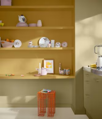
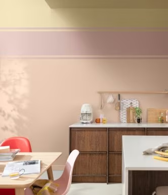
Tickle your tastebuds and have family fun in the kitchen, inspired by cheerful colour choices
4. Have fun and be the person who completely embraces the idea of colour as a creative expression.
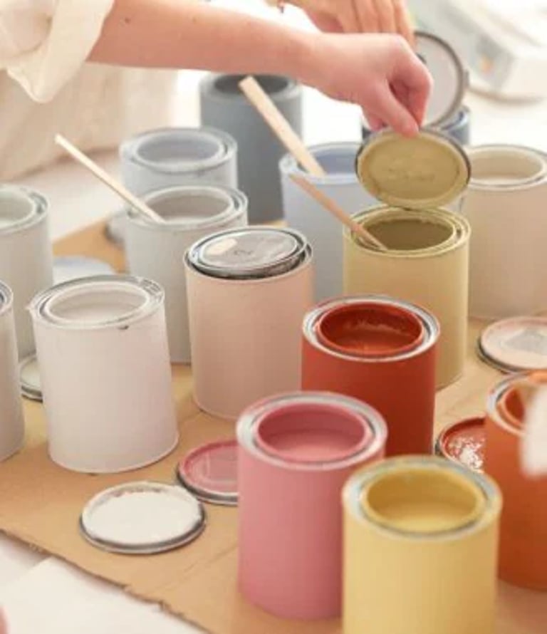
Not to just create the zones and spaces, but who actually has immense fun with accessories, textures and with a load of tester pots and masking tape. Some of the most joyful, inspiring instagram accounts are these people who are just having real fun. And I’m looking at the potential for all of us to upcycle pieces of furniture in extraordinary ways, to take paint up onto the ceiling, to go over the skirting boards, or try something new, like having checks on the walls.
So easy, yet so effective: transform a plain wall into a remarkable focal point
5. Listen to your instinct if you react emotionally to a colour.
There is one particular shade of blue I really dislike, and a few years ago it suddenly became all the rage. I realised I hate it because I used to wear it as a school uniform. It was just horrible. I hated wearing it, I didn’t like the school and every time I saw it, all I could think was, “This colour? Really?!” It’s not a colour that would ever have made me happy, and not one I’ll be using any time soon. So take heed of your emotions when you are choosing a shade, as you absolutely won’t enjoy it once it’s in your house.
6. You can no longer just say, “Yellow is an uplifting colour and it fills the house with sunshine.”
The one colour doesn’t do the same thing for everyone. Your colour choices should be bespoke to the person that you are, as the things that you need from it are really important. I don’t particularly like yellow. It makes me nervous! It reminds me of wasps and bumblebees. I wouldn’t want it in my living room because it’s so stimulating. And yet, you might use it in a bedroom if you have a grumpy teenager who just can’t get up in the morning. Alternatively, if you’re a morning person and you wanted to feel invigorated and uplifted, you might use a splash of bright yellow in your bathroom, or in a small area that you see first thing – whether that is tiles, towels or paint – so that little shot of sunshine can give you just what you need.
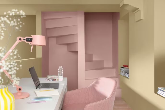
One room, two ways: pick the right colours for you to create the feeling you need in a space
7. Picking the right shade is a bit like dating. Colour dating!
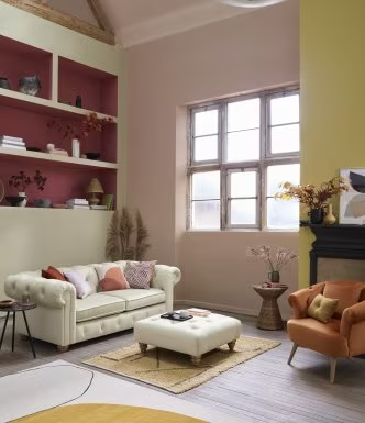
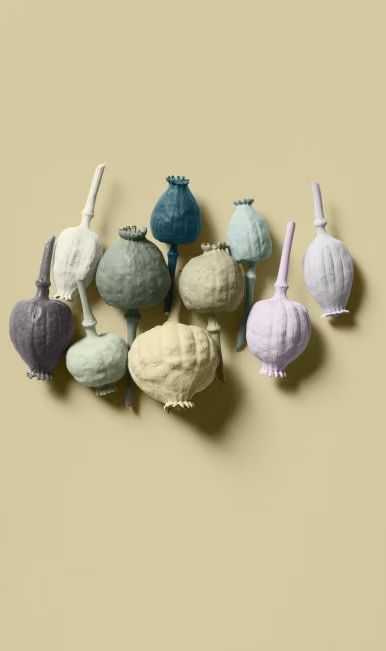
It’s all about matching the right person to the right colour to give them what they want from their homes. You’ve got to have chemistry! Knowing which colours you love, and how to put other shades with them, is something we’re doing more of. To go with this year’s colour, Wild Wonder, we created four palettes with complementary shades to help take the hard work out of finding colours that go together. Raw, Lush, Buzz or Flow – pick a palette that matches your personality, captures the right mood and gives you what you need from the space you’re going to decorate. Mix and match, then add in lamps, cushions, rugs all within the palette guidelines and you can’t go wrong.
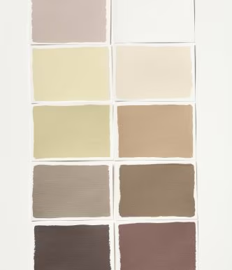
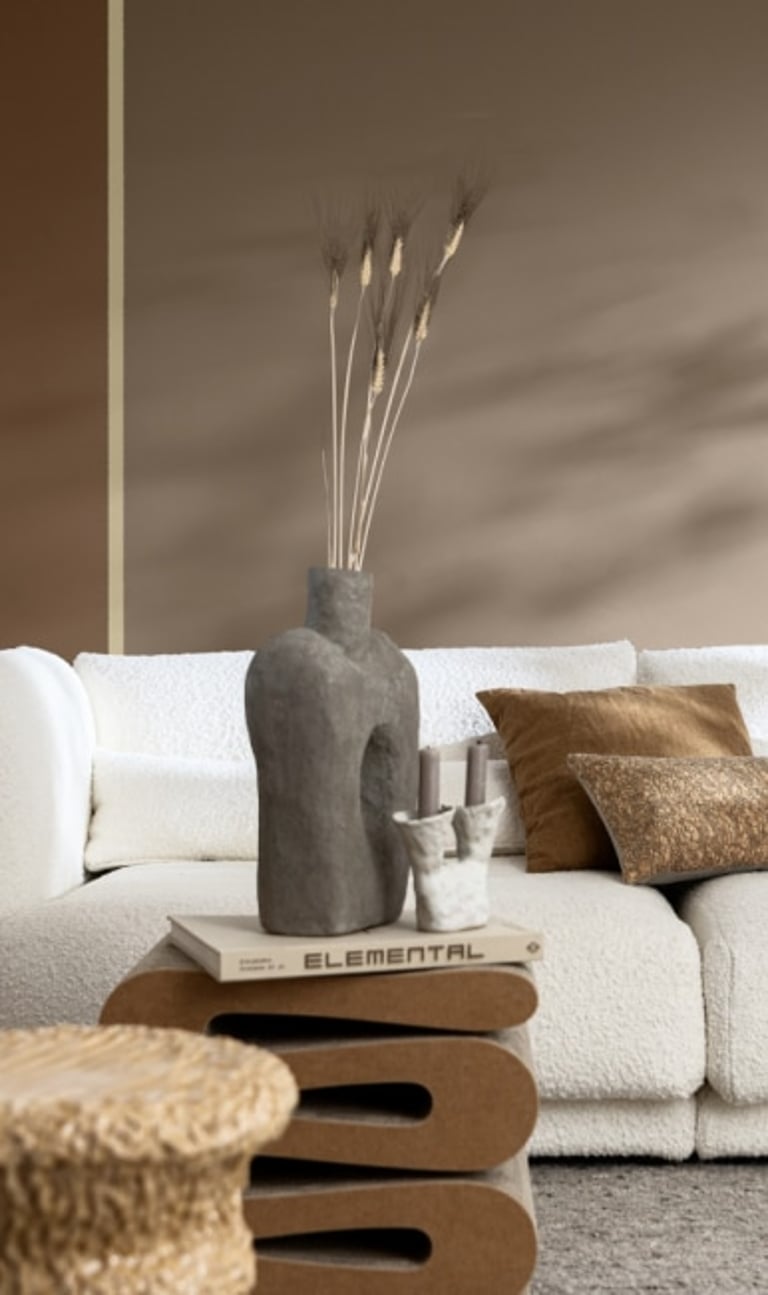
The RAW palette can be used to create a cosy feeling with natural tones
8. We all speak colour. It is such a simple, universal language.
If you go out in a full vermillion dress with Louboutin shoes and big, red lipstick, or a red jacket or a red tie, whatever it is for you… everybody knows you’re saying: “I’m in control, I’m powerful, I’m sexy!” You get up in the morning and you choose to put something on that is appropriate to the way you want to feel, and the part of you that you want to show the world. Which ‘you’ is turning up today? The one with the orange tights or the one with the black dress – who is it you want to be? We subconsciously do that every single day. And more and more that applies to our homes. Yes, we use colour to express ourselves through fashion, but also through our interiors. We have never been so exposed to the wider world as we have through social media – we share our living rooms with everybody on Instagram, and just like fashion, it becomes an expression of who we are.
Just like deciding what to wear each morning, how we dress our home is a reflection of our personality
9. Colour has the power to make us feel at peace, uplifted and happy.
I’ve been doing colour forecasting for 20 years, and I’ve noticed that when dreadful things happen to us as human beings – big disasters like the Boxing Day tsunami – we tend to hold our breath. We sulk for a bit, we hide, we go into our shells. Then the year after we respond and we come out fighting, we celebrate being alive, and that is what we see in colour trends through really amazingly joyful and powerfully uplifting colours. The human spirit is indomitable. Equally, we tend to find when we’ve all got a bit more money and stability, colour isn’t really there – that’s when the greys and cooler neutrals are around. But as soon as things start to go wrong, we embrace colour and metaphorically hit the town.
When life gets tough we want to feel cocooned and surrounded by natural colours, textures and plants
10. So we can expect a riot of colour in the next year!
We need it. We deserve it. We are still in a funk with this difficult period, and we all could do with some good news. At the moment we still need the soothing colours of nature to cocoon ourselves. But we are having flashes of joy within that, and we need to create more of those flashes. Playing with colour is affordable, accessible to everyone, and we should do it because it cheers us up. You know, if your front door is grey… it’s time to shake it up! Paint it in a gorgeous coral colour, or a pink, or a beautiful green. You put a smile on the face of your house. And when people walk past they won’t just ignore it, they will look at it – and they will smile too.
Get ready to go wild with bright and beautiful ways to decorate your home
Introduce colour even if you are restricted by renting
“I’ve lived in a rented flat in London with my husband for the last seven years, and I am Mrs Dulux Colour!” Marianne says with a grin. “So wherever I could, I’d put pockets of colour, and created this sense that we’d decorated the space without actually putting paint on the wall.”
Follow her tips to a more colourful rental…
Marianne loves nothing more than a blank canvas and a colour challenge
So there are solutions to having your home exactly how you want it, even if you rent. We are seeing a huge change with rentals because the next generation who can’t afford to buy their own homes are renting for longer. Landlords will have to become more flexible when it comes to bespoke decoration, and it would be so sad not to let people have the colours they love in the homes they live in.
Words: Mel Brodie
Images courtesy of Dulux